 Many small business owners are wondering how a web presence can have maximum effectiveness. Or in other words: how are calls to action actually designed to attract visitors to click on them? Or simply, “is my website effective?” Other questions we hear are, “should I spend the money on a site optimized for mobile phones?”; “when do I know I need to update my website?”
Our simple answer is “Measure and Modify”. As in real life nothing is perfect, so why not begin at a baseline and start improving from there, before spending money on less effective projects?
There is an abundance of neat tools to get the exact information you need to make decisions. Lets look at some examples:
1. “You need a website optimized for mobile, since 36% of all searches use smart phones and will ultimately look at your website.” WOW, if that was true, you better get a mobile version NOW.
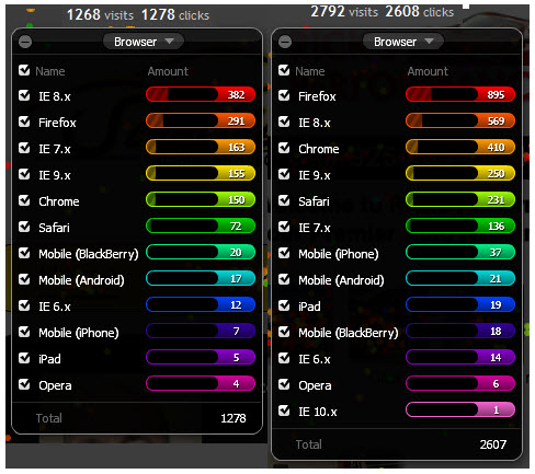
Let’s use real data from websites we host to see how we measure effectiveness. Below is a comparison of an auto repair shop website in Simi Valley, CA and Pleasanton, CA. Pleasanton is a town with median household incomes around $99k, and it seems that quite a bit of bay and silicon valley (=internet company) executives live here. Simi Valley is used as a comparison, where the mix of professions seems more balanced. Both websites are leading in rank for many relevant search keywords and see more than 700 hits per month.
Mobile browsers account for just 3.5% of all clicks on both websites. Does that justify a specific website development? You decide.
PS: 36% is actually the right number of mobile searches (as of July 2011), but this includes all searches on smart phones, anything searchable using a browser.
2. “Add movies to your website, as they help attract visitors to call you.”
That is a good one, and true as a general statement. The devil is in the detaisl as they say.
So many business owners and web designers get a movie about the shop or a customer testimonial clip and put it on the most precious real estate of the home page.
A no-brainer, isn’t it?
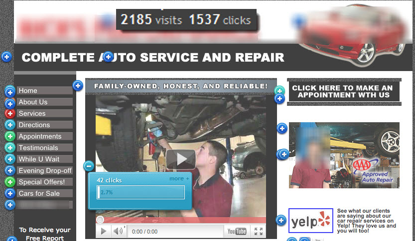
Lets look at a click map of a nicely done shop website with a nicely done movie:
What you can see is that only 70% of the visitors clicked anywhere on the home page. Not bad, but not stellar either. Of those 1537 clicks only 2.7% were interested in watching the video. Hmm, disappointing indeed. How can we improve that?
One way is to look at the user experience in the context of search. Or in other words – people don’t have ample time, and check out only things that seem interesting in the context of why they visited the website. Watching the movie during the first 10 seconds means making the decision whether or not the website will be explored further: the wrong place and the wrong time. Making sense? Where should the movie be placed instead then, and what should it convey through its opening image? What do YOU think?
Lets have a look at a more effective home page and make sure we have enough new visitors looking at it.
More clicks than visitors, that sounds promising. No video on the home page, only a teaser to a video. A photo gallery introducing the shop, highly clicked (upper right corner). Who would have thought?
Having trouble deciding what to tell your web designer? We can help.
See you next time here or somewhere on the road.
Uwe
Engage your auto repair customers at the counter and beyond
- Release Notes V6.0.52 (TVP.X) and V5.0.58 (TVP Legacy) - October 23, 2020
- Release Notes V6.0.50 (TVP.X) and V5.0.57 (TVP Legacy) - October 11, 2020
- Release Notes V6.0.47 (TVP.X) and V5.0.56 (TVP Legacy) - September 26, 2020


