We are getting quite a bit of questions about how to make a website encourage visitors to contact the business. Furthermore we encounter many business owners, who go only for a nice looking website when letting their web designer starting to work on their website. Lets be clear: a web design pleasing the eye is important. But not sufficient. And sometimes hurts the business.
Lets compare two landing pages from different websites, where the initial ‘taste” driven look reveals its shortcomings and the other, where the engagement score reveals a different result about the effectiveness.
In addition lets talk about the role of videos on the home page and the role of monitor sizes when thinking about the most effective webdesign.
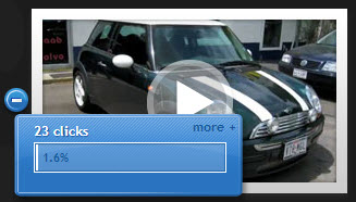
On the left is a video on the home page of one of the test sites.
1.6% clicks went to the video. What? one-point-six percent?
Yes. Why is it so low? “I have spent quite a bit of money on that video and it definitively looks great” is probably what a lot of business owners say.
Lets take a look at the typical searching experience in the automotive search world:
- I takes a motorist about 10 seconds to explore the Google’s search results and click on a link.
- Taking in the landing or home page of the website takes another 15 seconds.
- Once the motorist is engaged on the landing page, you have between 90 seconds and 3 minutes to get your message across, assuming it is a new visitor to the website.
So the focus should be on the the 15 seconds, when comes to effective webdesign.
To measure success we introduced the Engagement Score.
The engagement score is the number of clicks on the given page, divided by the number of visitors to the page. The goal should be an engagement score close to 100% or more.
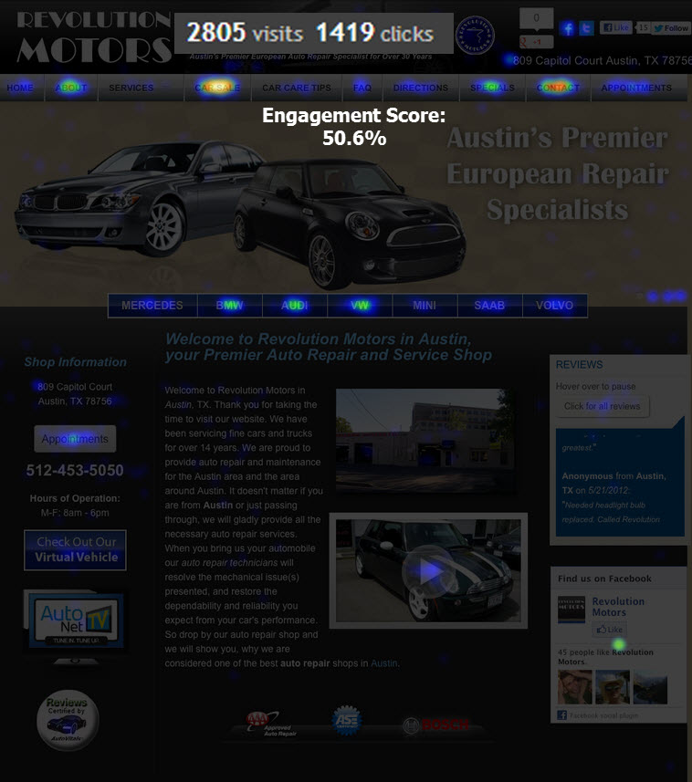
Before we try to figure out why videos are so ineffective lets take a look at the heat map of a nicely designed website compared with a website, which is effective on top of that. What is a heat map? It uncovers where people click on the page observed. The image below shows a website we copied 100% from the previous web design company in agreement with the business owner to find out the potential for improvement.
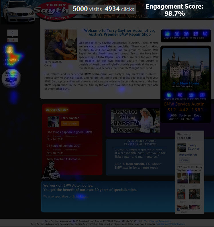
You can clearly see where the clicks go. Clear is also that the engagement score is only slightly above 50%, meaning only half of the visitors got engaged on the website. Lets look at a different website with a higher engagement score.
Isn’t the difference in engagement score surprising? Here are the major differences:
- generic (could be any shop) vs. personal introduction of the business owner
- lots of choices vs. a few choices (too many choices are bad, especially if the choices have nothing to do with the search term entered by the visitor)
- sterile (factual, marketing language) vs. sense of humor
- precious real estate is used for big slide shows with no functional meaning
Lets look at the last bullet a little bit more:
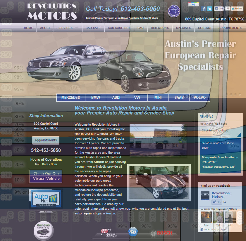
Check out the image below showing how many % of the visitors see what portion of the website without scrolling down. You’ll see that the tall slide show at the top leads to the fact that only 20% see the video at the bottom. This is one reason, why only 1.6% clicked on the video. the other reason lies in the fact that auto repair services are not as new and exciting as a new Hollywood movie coming out, so the video content is not interesting enough on the home page. Put on the “about us” page, it will service its purpose telling the visitor more about the business. It is not part of the 15 second attention span anymore and the visitor is interested now.
Does this make sense? Let’s collaborate on how to make a website effective.
thank you
Uwe
- Release Notes V6.0.52 (TVP.X) and V5.0.58 (TVP Legacy) - October 23, 2020
- Release Notes V6.0.50 (TVP.X) and V5.0.57 (TVP Legacy) - October 11, 2020
- Release Notes V6.0.47 (TVP.X) and V5.0.56 (TVP Legacy) - September 26, 2020


