Using smartphones and tablets to search for local businesses has become a wide spread habit and is going to increase, because it is highly convenient. Due to the much smaller available space on especially smartphones easy navigation becomes key for a great user experience. Lets look at a typical website, which has not been optimized yet:
You can see that 16.7% of website visitors went to the site on a mobile device, the iPhone leading the chart. This rate of mobile visitors varies by region. Hi-Tech hot beds like Silicon Valley lead the chart with 15% to 25% of all visitors. This number easily justifies the need for a mobile optimized website, especially if you look at a bounce rate of 75% like in the image above. That means only 25% of all visitors on the mobile site explored the site further and clicked on a link or button on the home page. There are more than one reason for this, but the inability to easily navigate is at the top of the list.
What does optimized for mobile mean? Check out a full site on an iPhone, which is rich and easily navigated on PC browser:

Navigating this site on the iPhone is possible but a little challenging. Thus our criteria for simplification of a mobile site have been concluded to be:
- Scrolling down is easy, so information is placed on top of each other in a one column design.
- Allow to call the business and find it on the map with one click.
- Allow for convenient appointment requests and ask only for the absolutely necessary information.
- Create a branding experience, and provide information about services offered
Last but not least: Allow for a switch to view the full site for gathering more information. The images below show the screen shots results for those user interactions, which are mostly done on a mobile site:
Clicking on the standard website URL (it automatically forwards to the mobile site) and scrolling down:
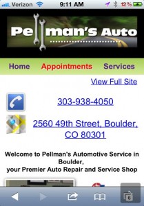

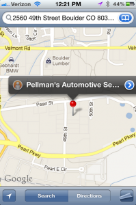
Clicking on the phone number or address reveals:
Calling or finding the shop is now super easy, just one click away.
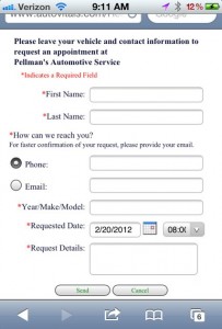
Last but not least ‘requesting an appointment’ is shown below, in one of the future releases existing customers will even be able to select their vehicles and safe some typing.
Do you need a mobile website for your business?
The numbers suggest so.
Why don’t you check your website on a smartphone and then make a decision? We are happy to help you determine how many visitors have looked at your website on their mobile device.
As always, check back for more or subscribe to posts on this blog, you won’t be disappointed.
Uwe (Oova)
Every business needs 3 ingredients for an effective website, do you know which ones?
- Release Notes V6.0.52 (TVP.X) and V5.0.58 (TVP Legacy) - October 23, 2020
- Release Notes V6.0.50 (TVP.X) and V5.0.57 (TVP Legacy) - October 11, 2020
- Release Notes V6.0.47 (TVP.X) and V5.0.56 (TVP Legacy) - September 26, 2020


